How to Choose the Right Rug Colour
Start with your floor and your largest piece of furniture, usually the sofa or bed, then decide whether you want the rug to blend in or stand out. Matching creates a calm room that reads larger. Contrasting makes the rug the focal point. Decide that first, because it settles everything after it: the exact shade, the pattern and how forgiving the rug needs to be.
Match or contrast. Matching the rug to your floor and furniture tones makes a room feel calm, larger and pulled-together. Contrasting, a darker rug on a light floor, or a bold colour against neutral furniture, makes the rug a feature. Both work; it depends on whether you want the rug to recede or lead.
| | Match | Contrast |
|---|
| Effect | Calm and cohesive. The room reads larger because the floor looks like one continuous surface. | The rug leads and becomes the focal point of the room. |
|---|
| Try it as | Light-to-mid grey rug on a grey floor, or warm beige on a wooden floor. | A darker rug on a light floor, or a bold colour against neutral furniture. |
|---|
| Choose when | You want the space to feel bigger and the furniture to lead. | You want one strong feature and the rest of the room stays calm. |
|---|
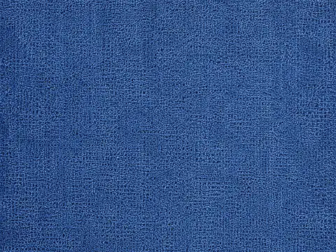
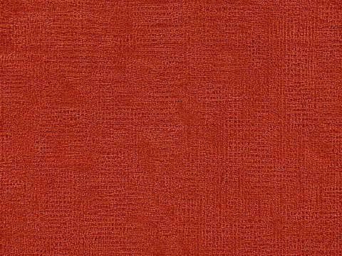
With a grey floor or grey sofa, the easiest colours are warm neutrals (cream, sand, taupe) to soften the cool grey, or a tonal light-to-mid grey to keep the look consistent. For character, sage green, navy or slate blue sit beautifully against grey. With a wooden floor, warm tones (beige, terracotta, rust, olive) echo the wood, while blues and greens give a fresh contrast.
Neutrals are the safe base. Grey, beige, cream and taupe suit almost any scheme and let you change accents over time. Bold colours are statement pieces, best when the rest of the room stays calm, so the rug leads without the space feeling busy.
Room size and light. Light colours make a room feel bigger and airier; dark colours make it feel cosier and more intimate. In the strong natural light of UAE homes, colours read brighter and warmer than on a sample, so mid and deeper tones hold up well and rarely feel heavy.
Practicality. In high-traffic rooms and family villas, mid-tones and patterns hide dirt and wear far better than very light or very dark plains, which show every mark. Match the colour to how hard the room is used, not just the look.